The following information was extracted from http://en.wikipedia.org/wiki/Unity_of_opposites.
The unity of opposites was first suggested by Heraclitus (ca. 535–475 BC) a pre-Socratic Greek philosopher.
Philosophers had for some time been contemplating the notion of opposites. Anaximander posited that every element was an opposite, or connected to an opposite (water is cold, fire is hot). Thus, the material world was composed by some indefinite, boundless apeiron from which arose the elements (earth, air, fire, water) and pairs of opposites (hot/cold, wet/dry). There was, according to Anaximander, a continual war of opposites. Anaximenes of Miletus, a student and successor of Anaximander, replaced this indefinite, boundless arche with air, a known element with neutral properties. According to Anaximenes, there was not so much a war of opposites, as a continuum of change. Heraclitus, however, did not accept the milesian monism and replaced their underling material arche with a single, divine law of the universe, which he called logos. The universe of Heraclitus is in constant change, but also remaining the same. That is to say, an object moves from point A to point B, thus creating a change, but the underlying law remains the same. Thus, a unity of opposites is present in the universe as difference and sameness. This is a rather broad example though. For a more detailed example we may turn to an aphorism of Heraclitus:
The road up and the road down are the same thing. (Hippolytus, Refutations 9.10.3)
This is an example of a compresent unity of opposites. For, at the same time, this slanted road has the opposite qualities of ascent and descent. According to Heraclitus, every object co-instantiates at least one pair of opposites (though not necessarily in simultaneously) and every pair of opposites is co-instantiated in at least one object. Heraclitus also uses the succession of opposites as a base for change:
Cold things grow hot, a hot thing cold, a moist thing withers, a parched thing is wetted.
As a single object persists through opposite properties, this object undergoes change.
-----------------------------------------------------------------------
In his philosophy, Hegel ventured to describe quite a few cases of "unity of opposites", including the concepts of Finite and Infinite, Force and Matter, Identity and Difference, Positive and Negative, Form and Content, Chance and Necessity, Cause and Effect, Freedom and Necessity, Subjectivity and Objectivity, Means and Ends, Subject and Object, and Abstract and Concrete, Seven Sins and Seven Virtues
-----------------------------------------------------------------------
I decided to work in the same order as my seven sins brief as i felt that worked for me producing the posters first. I was happy with the way my previous posters had come out but will simplify the posters down to 1 colour and stock, so black and white. I decided upon using square and circles to represent some of the opposing theories. I figured they were the simplest opposing shapes.
After working on the Seven Sins booklet and having time to reflect on what happened with that booklet. I've decided to change a few things around and simplify the content of the book even more, this would also account for the short deadline i've left myself by having a weeks placement in between.
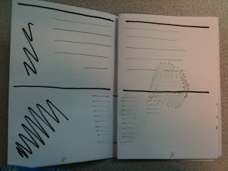
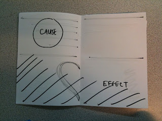
I will keep the scale and format of the booklet I've also decided to change the layout of the book focusing upon making each double page spread display the opposing elements as apposed to flipping from front to back; as in the seven sins booklet. I feel this is an easier way for people to read the information.
I decided to work in the same order as my seven sins brief as i felt that worked for me producing the posters first. I was happy with the way my previous posters had come out but will simplify the posters down to 1 colour and stock, so black and white. I decided upon using square and circles to represent some of the opposing theories. I figured they were the simplest opposing shapes.
I was trying to think of how i could display opposites in a different way from before and keep a balance to the poster.
These few poster designs contributed to the feel of the booklet including its content and front cover.
Cause and Effect
Chance and Necessity
Infinity
Means and Ends
Order and Chaos
Positive and Negative
Dual full display posters i used the simplistic elements of the square and circle and mimicked what i'd done with the seven sins posters in terms of text.
-----------------------------------------------------------------------
I will keep the scale and format of the booklet I've also decided to change the layout of the book focusing upon making each double page spread display the opposing elements as apposed to flipping from front to back; as in the seven sins booklet. I feel this is an easier way for people to read the information.


-----------------------------------------------------------------------

I started to work on different layouts for just text and imagery also and how i could make each page the opposite of the other. I also came up with different elements relating to the quotes in some places and explored these quickly in indesign making quick decisions with the layout and page elements.


As i was saying before, the way the audience had to flip around the seven sins booklet was perhaps a little too much so i decided to make each spread have opposite composition and colour variation.

I had an idea about having each spread be bias. For example, in the image above the display of the I can't I cannot I won't sways towards the negative aspect. I decided that this just over complicated everything and went back to a simplistic layout and typed information regarding the mythology of the different entities, with a focus on philosophy.


I made these mock ups with out a clear mock up identifying page order and an introductory page
so i made a hand produced mock up, detailing what went on what page and developed the introductory image and quote.
-----------------------------------------------------------------------


I halftoned the image i found of Heraclitus. The image above appears very dark in comparison to the actual print out and i think it works better that way.


-----------------------------------------------------------------------

My mock up print identified to me a couple of widows and spelling mistakes. I quickly rectified these and pushed onto printing. I wanted to use the same stock as the seven sins brief as i believe the difference in texture and weight of bulky newsprint and sugar paper provided a good balance to the publication, keeping in with the idea of balance and opposites.

My mock up print identified to me a couple of widows and spelling mistakes. I quickly rectified these and pushed onto printing. I wanted to use the same stock as the seven sins brief as i believe the difference in texture and weight of bulky newsprint and sugar paper provided a good balance to the publication, keeping in with the idea of balance and opposites.
-----------------------------------------------------------------------


-----------------------------------------------------------------------
I collected both the seven sins brief and this brief together and was preparing to package them in the same way wrapped within the poster, but decided this produced a large scale package which looked cheap when placed within a sealable bag. I came up with the idea of a small box with a sliding cover. So i ordered some boxes from the internet they arrived and are too large to use.

I'm sure they will come in handy for something later on. I may even use the scale to create a collection of screen prints and try and fill the box by the end of the year. Summer project hello. I also feel that the box idea may be a bit too much for such a small collection.
At the start of my seven sins brief i had the idea of producing an eatable poster using rice paper. I never used it and moved away from the idea. I plan on packaging the posters/booklet pack within this rice paper with string.
Rice Paper
-----------------------------------------------------------------------
The crit raised some questions about the differences between each of my booklets and posters. Why did i chose to produce one in colour and the other in black and white. I decided to go back and see which i preferred.
Although the attitude to working solely in black and white wasn't appreciated i still think that works best. I also feel the differences between the two add some variety to the pieces and separate them, they do however work as a set.


No comments:
Post a Comment