Book List and Themes
Donnie Darko
Time-Travel
Vortex
Dimensions
Paranormal
Schizophrenia
Family
28 days... 6 hours... 42 minutes... 12 seconds. That... is when the world... will end.
I hope that when the world comes to an end, I can breathe a sigh of relief, because there will be so much to look forward to.
Some people are just born with tragedy in their blood.
Deus ex machina
Every creature on this earth dies alone.
----------------------------------------------------------------------
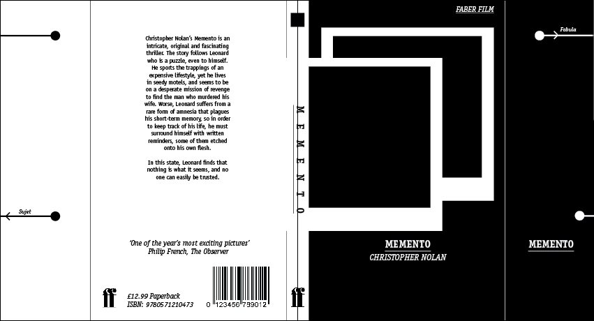
Memento
Memory Loss
Identity
Memento Mori - Remember you must die
Film's two storylines occur in chronological order and reverse order respectively.
Here is a diagram provided to decode the timeline. (Fabula_and_sujet)
She's gone. And the present is trivia, which I scribble down as fucking notes.
I always thought the joy of reading a book is not knowing what happens next.
Memory can change the shape of a room; it can change the color of a car. And memories can be distorted. They're just an interpretation, they're not a record, and they're irrelevant if you have the facts.
We all need mirrors to remind ourselves who we are. I'm no different.
----------------------------------------------------------------------
The Usual Suspects
Deception
Crime
Con
Twin Identity
Robbery
Pride, honour, arrogance, betrayal and fear (links in with seven sins brief)
What the cops never figured out, and what I know now, was that these men would never break, never lie down, never bend over for anybody. Anybody.
Who is Keyser Soze?
One cannot be betrayed if one has no people.
How do you shoot the devil in the back? What if you miss?
After that my guess is that you will never hear from him again. The greatest trick the devil ever pulled was convincing the world he did not exist. And like that... he is gone.
Keaton always said, "I don't believe in God, but I'm afraid of him." Well I believe in God, and the only thing that scares me is Keyser Soze.
A man can convince anyone he's somebody else, but never himself.
----------------------------------------------------------------------
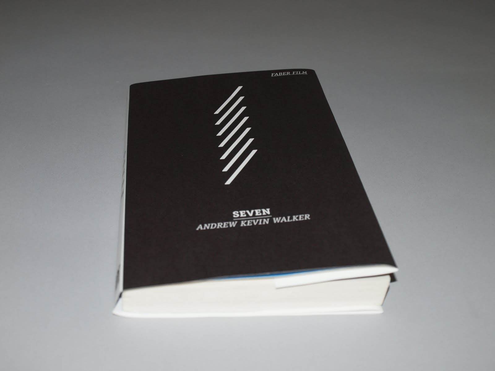
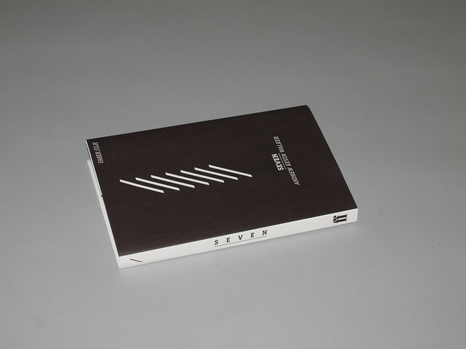
Seven
Sins
Murder
Games
Deception
Balance
Ritual
Ernest Hemingway
The world is a fine place and worth fighting for.' I agree with the second part
David Mills: Wait, I thought all you did was kill innocent people. John Doe: Innocent? Is that supposed to be funny? An obese man... a disgusting man who could barely stand up; a man who if you saw him on the street, you'd point him out to your friends so that they could join you in mocking him; a man, who if you saw him while you were eating, you wouldn't be able to finish your meal. After him, I picked the lawyer and I know you both must have been secretly thanking me for that one. This is a man who dedicated his life to making money by lying with every breath that he could muster to keeping murderers and rapists on the streets! David Mills: Murderers? John Doe: A woman... David Mills: Murderers, John, like yourself? John Doe: [interrupts] A woman... so ugly on the inside she couldn't bear to go on living if she couldn't be beautiful on the outside. A drug dealer, a drug dealing pederast, actually! And let's not forget the disease-spreading whore! Only in a world this shitty could you even try to say these were innocent people and keep a straight face. But that's the point. We see a deadly sin on every street corner, in every home, and we tolerate it. We tolerate it because it's common, it's trivial. We tolerate it morning, noon, and night. Well, not anymore. I'm setting the example. What I've done is going to be puzzled over and studied and followed... forever.
He's a nut-bag! Just because the fucker's got a library card doesn't make him Yoda!
Become vengeance, David. Become wrath.
People don't want a hero, they want to eat cheeseburgers, play the lotto and watch television.
Ladies and gentlemen, we have ourselves a homicide.
----------------------------------------------------------------------
Big Lebowski

Mistaken Identity
Bowling
Donnie
The Dude Abides
Con
Jeff 'The Dude' Lebowski
Walter Sobchak
Theodore Donald 'Donny' Kerabatsos
Jeffrey Lebowski
Maude Lebeowski
Bunny Lebowski
Jesus Quintana
Oh, the usual. I bowl. Drive around. The occasional acid flashback.
Fuck sympathy! I don't need your fuckin' sympathy, man, I need my fucking johnson!
God damn you Walter! You fuckin' asshole! Everything's a fuckin' travesty with you, man! And what was all that shit about Vietnam? What the FUCK, has anything got to do with Vietnam? What the fuck are you talking about?
This is what happens when you fuck a stranger in the ass!
Yeah, well, you know, that's just, like, your opinion, man.
----------------------------------------------------------------------
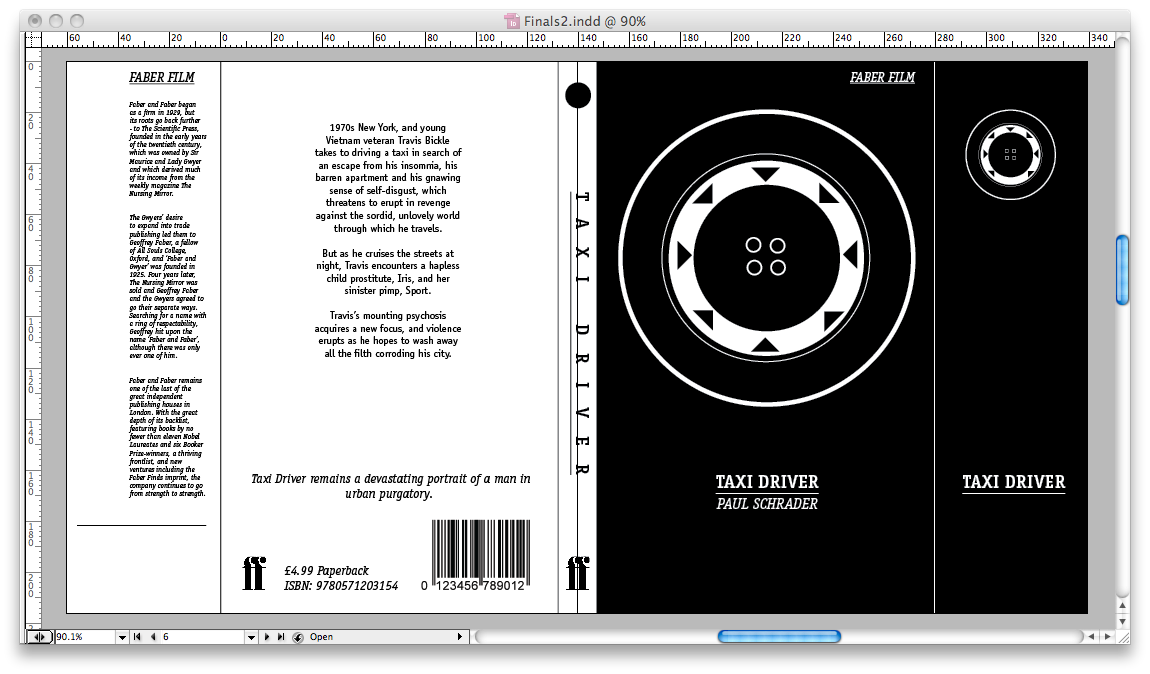
Taxi Driver

Taxi
NYC
Disease
He's a prophet and a pusher, partly truth, partly fiction - a walking contradiction.
In "Scorsese on Scorsese" the director mentions the religious symbology in the story comparing Bickle to a saint who wants to clean up both life and his mind. Bickle attempts suicide at the end of the movie as a way to mimic the Samurai’s “death with honour” principle
Hey, I'm not square, you're the one that's square. Your full of shit, man. What are you talking about? You walk out with those fuckin' creeps and low-lifes and degenerates out on the streets and you sell your little pussy for peanuts? For some low-life pimp who stands in the hall? And I'm square? You're the one that's square, man. I don't go screwing fuck with bunch of killers and junkies like you do. You call that bein' hip? What world are you from?
Shit... I'm waiting for the sun to shine.
Thank God for the rain to wash the trash off the sidewalk.
The idea had been growing in my brain for some time: TRUE force. All the king's men cannot put it back together again.
All the animals come out at night - whores, skunk pussies, buggers, queens, fairies, dopers, junkies, sick, venal. Someday a real rain will come and wash all this scum off the streets. I go all over. I take people to the Bronx, Brooklyn, I take 'em to Harlem. I don't care. Don't make no difference to me. It does to some. Some won't even take spooks. Don't make no difference to me.
Loneliness has followed me my whole life. Everywhere. In bars, in cars, sidewalks, stores, everywhere. There's no escape. I'm God's lonely man... June 8th. My life has taken another turn again. The days can go on with regularity over and over, one day indistinguishable from the next. A long continuous chain. Then suddenly, there is a change.
Listen, you fuckers, you screwheads. Here is a man who would not take it anymore. A man who stood up against the scum, the cunts, the dogs, the filth, the shit. Here is a man who stood up.
I got some bad ideas in my head.
----------------------------------------------------------------------
I started jotting down ideas for Donnie Darko bookcovers using the information presented above and i've included them in the following images but decided they were jumping around a bit and it seemed to me like i was going round in circles trying to make a decision.
I made a list of the items i would need to put on each book cover and produced a list of different information i could use for the front covers. Those were geometric shapes, quotes and the character names? After giving it some more though i though the idea of using quotes from the films would be an interesting idea to explore, this also lead me to explore the use of character names on the front cover.
Using the quote idea i explored different typographic elements i could use and experimented quickly with layouts.
Over the duration of this module my interest in type and layout has increased drastically and these designs were heavily type based but i want to produce covers with some illustrative aspects.
----------------------------------------------------------------------
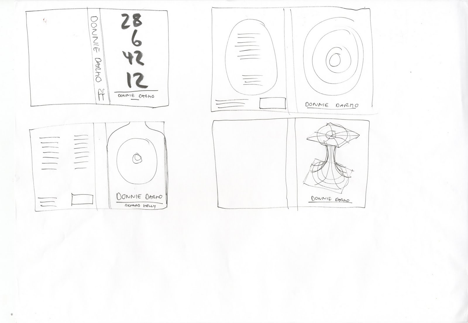
I continued with developing my initial idea of using geometric shapes to convey key aspects of each film. My idea for Donnie Darko centred around the idea of a vortex which in the film is responsible for the dimension travelling jet engine.
I started to explore different ways in which i could keep the circle running throughout the book cover and different ways of representing a vortex ranging from a single circle to a multiple inlayed circle and how this can be applied across the frame of a book.
 I wasn't sure how simplistic the covers would be with hardly any elements included so added to the vector circles with the numbers quoted by Frank the Rabbit.
Another quick idea was using letterforms to represent the different timelines created in the film. After doing this i decided to continue with my geometric shape ideas and keep each over minimal.

----------------------------------------------------------------------
The memento covers
After watching Memento it became apparent the use of polaroids and film are in developing the story line of the film. So the obvious shape to use would be a square. I made my shape and thought about how i could continue the series and keep continuity between the front and back covers.

An idea that i had reflected the backwards timelines of both memento and donnie darko, which involved switching the front and back cover; in doing so the blurb was on the front. I thought this was a really interesting idea but couldn't think of a way to reflect that in the other covers i've chosen to do.
I'm afraid with these designs that they are becoming minimal vector interpretations of their pre-existing movie posters. But i made the decision to continue as i believe the movie posters will play a vital role in the audience recognising the minimalist interpretation and associated the imagery with the title. In effect, the audience will be able to judge the book by its cover. I see this as an advantage.
----------------------------------------------------------------------
The Usual Suspects
I was still thinking about the reinterpretation of the movie posters and decided that it wasn't copying but using existing material to influence my design development. Thus the usual suspects followed the theme of geometric shapes representing elements from the existing movie poster. The police lineup image is iconic. I didn't want to spend lots of time exploring a different representations when this worked perfectly. Over the course of this module, i've started to find what works for me and what doesn't in terms of everything i've been taught and am finding my own way of doing work. I probably don't analyse things as much as i should and granted this may cause problems when it comes to my final grade but i'm more interested in producing work that looks good and answers the brief.

 One area of my work that continues to be sloppy however is the illustrating of my initial design ideas. I've always worked fast and jumped straight onto a mac, which is something i want to address but fail to do. I'm putting it down to poor time management but also my over eagerness to get stuck into production. Maybe my future lies in being an Art Worker and doing personal work on the side perhaps where my income doesn't rest on presenting multiple ideas to clients.
Notes: Update PPD blogs with searches for Art Worker jobs.
----------------------------------------------------------------------
Seven
Seven's movie poster features strikes for each sin albeit as a minor feature. I thought featuring these was a subliminal way of expressing the theme of the film. I also thought about simply having a 7 on the front cover, but this diverted away from my geometric shapes theme and would be out of key with the other covers.

 I continued to try and reflect the imagery from the front on the back for the blurb to fit around. I'm thinking of just having a plain blurb in the same format on every cover.
----------------------------------------------------------------------
The Big Lebowski
The Dude Abides. Numerous scenes take place in the bowling alley during The Big Lebowski. My focus drew to one of two things - a circle to represent a bowling ball but i felt this was too in your face obvious; when compared with the ideas i'd generated for memento and the usual suspects. It has also been done to hell across all kinds of publicity for the film.

I also had an idea of to include a rectangle rather than a triangle. The rectangle would reflect The Dudes obsession with his missing rug; as it tied the room together.

----------------------------------------------------------------------
Taxi Driver
I was researching into the themes of taxi driver and came across an interesting page about the significance of water and how Travis Bickle plans to cleanse the streets of New York.
 Some of the other ideas i thought about were a wheel of a taxi, the display plate on the roof of a taxi and the lanes of New York streets.
----------------------------------------------------------------------
I'd completed my initial sketched ideas and proceeded to work on a more concrete layout with all the necessary information contained on it. Those were:
- Faber Film / Faber Logo
- Title
- Author
- Price
- Synopsis
- Barcode / ISDN Number
I considered how all these would interact with the imagery i'd would create for each cover and made changes to the placement of the author and title and logos.
I also had an idea of extending the front covers and perforating the edge so the audience can tear away this overflap and have a free bookmark. I thought this would add an extra element of context to the covers and work well with the posters i plan to produce also.
 I decided to proceed with producing a centralised layout as this was a simplistic and 'easy' approach to laying out the illustrative elements and type together.
----------------------------------------------------------------------
I produced The Big Lebowksi cover first but wasn't too sure about the typeface i'd chosen to use so explored how i could apply the same styles in different typefaces, as i felt the hierarchy was working well.
I've began using a select few typefaces across my work so decided to stick with them and keep some sort of unification going throughout my work.
Avant Garde
Din
For me, Avant Garde and Din work perfectly as large format title text but something doesn't sit right in body copy. I think they are more display typefaces.
 Gotham is one of my favourite typefaces as of late i use it quiet a lot within my work; personal or otherwise. It is a typeface that can be used for large copies of text or titles.
 Miso
I was intrigued by the positioning of the type on the front cover, but Miso in body text doesn't work for me as it is very condensed.
Miso
I was intrigued by the positioning of the type on the front cover, but Miso in body text doesn't work for me as it is very condensed.
I decided to produce the rest of the covers with as i felt there was an interesting balance between the serif and san-serif versions of this typeface and the body copy sat well on the back cover.
----------------------------------------------------------------------

----------------------------------------------------------------------
I produced the rest of my covers but presented an alternative to the bookmark sections that can come off, in that the books represent another theme of the book. For the Donnie Darko and Memento books i represented the disjointed timelines across the two pieces.
 The bookmark i produced for Seven was simply a list of the Seven Sins in order they appear in the film and aligned with the tops of each strike on the front cover. I used this device to work for The Usual Suspects and align the increments of height with each line.
----------------------------------------------------------------------
I was happy with each layout i'd produced for the covers and was impressed with how i could communicate these different ideas using black and white but felt the use of colour would make them stand out more. I explored various colours i thought were appropriate to the film.

I also began to explore using colour across the whole cover apart from the spine and see how this worked with the type and other elements. I don't think the black type on the reverse works particularly well or stands out and would be too hard to read.

I experimented with the positioning and opacity of the polaroid frames and decided the best way to keep everything in series is to have a single graphic element as the central focus of the cover.

I reworked the memento imagery as i thought two polaroids overlapped was too much and cluttered the front cover.


I've explored different colours but to be honest i think they best work in simple black and white. I don't want to spend much longer on this brief as its only a small couple of days brief.
----------------------------------------------------------------------
Final Designs


----------------------------------------------------------------------
I printed out some full scale A3 standard proofs in to check through each looking for typos and differences between key elements. I was happy with the way they looked so continued to print on different stocks i had available, sadly at a reduced size.
----------------------------------------------------------------------
I explored different coloured stocks to see how the black would work on different coloured. This pale orange stock i found worked beautifully but the contrast between the black and background lost impact by taking away the white stock.
I also tested a bright white stock which works perfectly and although very simple idea i think it works really well. It also had a good weight and texture on the reference.
I ended up choosing an off white stock which worked best. It had a strong texture and feel and i liked the subtle shade of the stock contrasting with the heavy black
----------------------------------------------------------------------
I paid a visit to Gadsby's in town and picked up some Stow Book Natural White 150gsm and printed the covers on the laser printers up in Room 202. Unfortunately this proved inappropriate as the printed just flaked off the page. I laid each print out to see how they looked. I was impressed with how they all worked as a series, albeit The Usual Suspects cover stands out most as it is the odd one out.
I could produce this alternate version so it is in key with each of the other covers.
----------------------------------------------------------------------
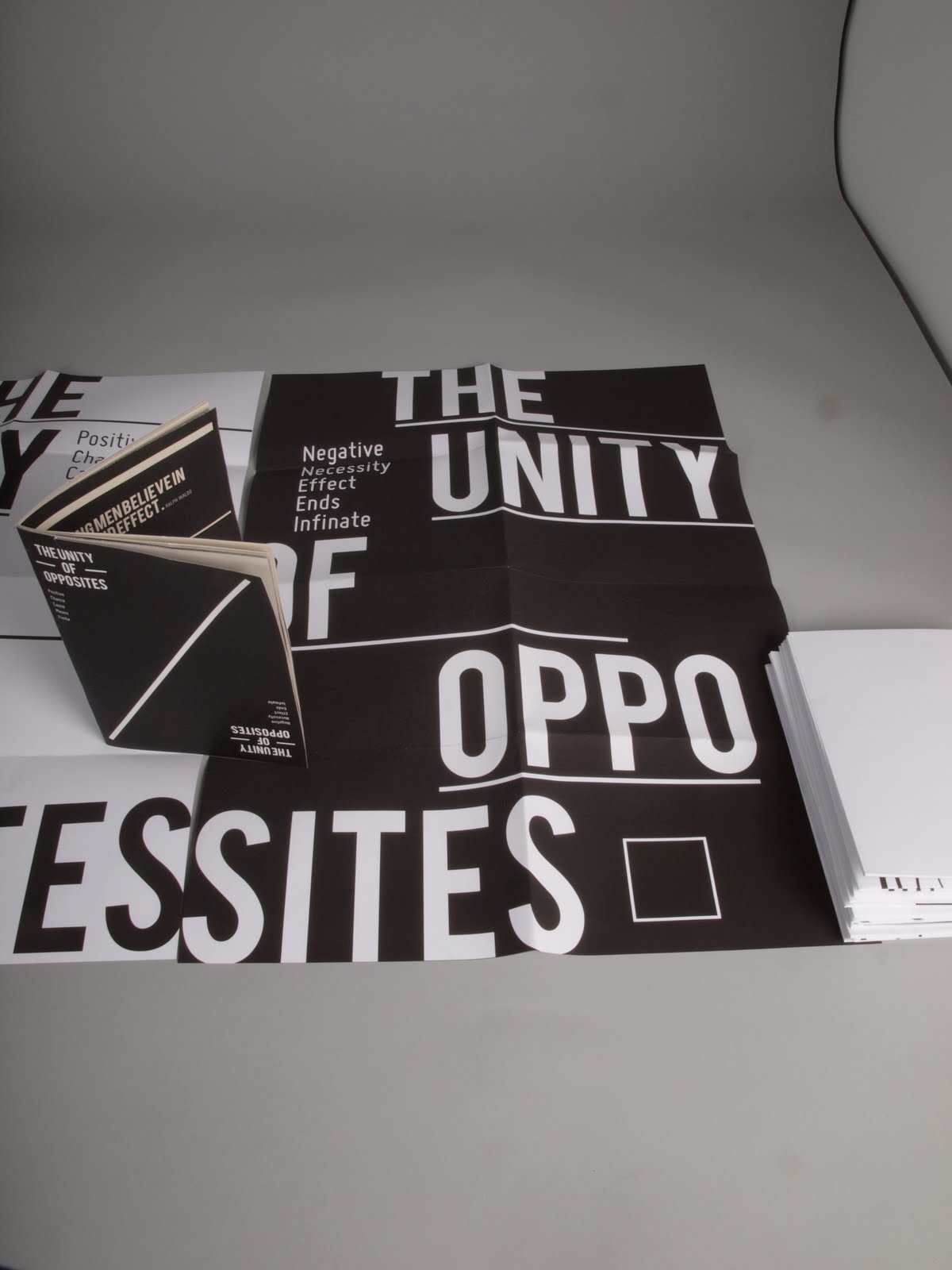
For the posters i wanted to simply recreate the covers on a different scale but give them more depth.
I started making a few mock layouts and how the information should be displayed.
In the end i settled on a simple centred justification on all the elements.


----------------------------------------------------------------------


----------------------------------------------------------------------

----------------------------------------------------------------------

----------------------------------------------------------------------
It came to the crit and my feedback was favourable but was suggested i should explore more colour and use different type faces as a lot of my work for this module revolves around the same typefaces. To that i say - i don't care.
My aim for this brief was to produce a minimalist approach to these films and black and white is the bare minimal. As for using an abundant amount of typefaces, why should i. I know which typefaces i like working with and how i can manipulate them to communicate the different messages across a variety of briefs.
Regardless some good points were raised to0. Little tweaks that will make the project more substantial and add context to it.
I added extra information to the left hand side column of the dust jacket. The information i gathered was taken from the faber.co.uk website - About Us section.


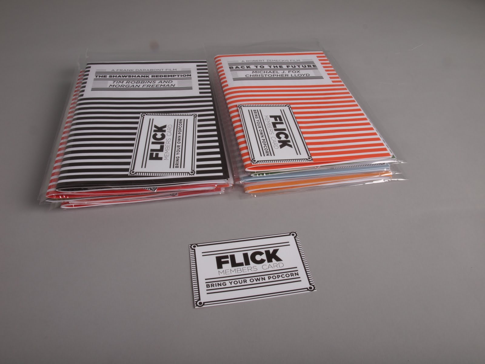
I also created these bookmarks. The visuals are carried across each aspect of the series.


----------------------------------------------------------------------
I also created this letter to accompany an online order of books.
I'm going to package the book in a jiffy bag with the letter and bookmarks and folded up poster to give it an added context.
and a website banner for the series