Me and Jack decided to organise a series of movie nights starting with Ferris Bueller's Day Off.
The posters i designed for the first four weeks were designed over the course of a day.
As a pair we have split our duties according to our design expertise. I handled the print promotion (posters) which double up as a program for the event including a synopsis and 10 top facts about the film. I was having trouble working with the original brief i'd set myself so i rewrote my movie prints brief to incorporate the movie night and the movie prints together, as i felt they were essentially the same brief.
--------------------------------------------------------------
So with that in mind i am starting a fresh with a new list:
1) The Goonies
2) Ferris Buelller's Day Off
3) Back to the Future II
4) Indiana Jones: Raiders of the Lost Ark
5) Home Alone
6) The Breakfast Club
7) Teenage Mutant Ninja Turtles II: Secrets of the Ooze
8) Shawshank Redemption
9) Die Hard
10) Ghostbusters
Ferris Bueller's Day Off is a 1986 American comedy film written and directed by John Hughes. It stars Matthew Broderick, Alan Ruck, Mia Sara, Jeffrey Jones and Jennifer Grey.
7) Teenage Mutant Ninja Turtles II: Secrets of the Ooze
8) Shawshank Redemption
9) Die Hard
10) Ghostbusters
Ferris Bueller's Day Off is a 1986 American comedy film written and directed by John Hughes. It stars Matthew Broderick, Alan Ruck, Mia Sara, Jeffrey Jones and Jennifer Grey.
I RECALL CENTRAL PARK IN FALL...
There are many brilliant quotes from Ferris Bueller. My favourites been
"Life moves pretty fast. You don't stop and look around once in a while, you could miss it. "
and
"Pardon my French, but Cameron is so tight that if you stuck a lump of coal up his ass, in two weeks you'd have a diamond. "
"Pardon my French, but Cameron is so tight that if you stuck a lump of coal up his ass, in two weeks you'd have a diamond. "
I couldn't get the cardigan to look how i wanted and since at this stage i had an afternoon to get the poster done and had full creative control i didn't have time to dwell too much upon my design decisions. At this stage in the FMP i feel i work best under pressure and make decisions quick and well informed.
I produced the poster above for the movie night me and jack are hosting. It looks cool and thats all a movie poster, music poster has to do.
--------------------------------------------------------------
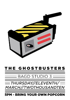
Ghostbusters, titled on-screen as Ghost Busters, is a 1984 American science fiction comedy film written by co-stars Dan Aykroyd andHarold Ramis about three eccentric New York City parapsychologists-turned-ghost exterminators.
I decided to create the poster with the ghost catcher device. Since i was working to a strict deadline to get them ready for the movie night i feel as if i produced a slap-dashed poster so i when i had a little extra time i went back and built upon the illustration below.
First Poster
First Poster
I made sure that the panels lined up and added the wire and extra detail on the button and switch section. To do this i experimented with the revolve tool to produce a 3d button.
--------------------------------------------------------------
Back to the Future Part II is a 1989 science fiction adventure film and a sequel to the 1985 film Back to the Future. Like the previous film, it was directed by Robert Zemeckis and written by Zemeckis and Bob Gale. Part II and the third installment of the trilogy, Back to the Future Part III, were filmed back-to-back, with some of the scenes of Parts II and III filmed concurrently, and released six months apart. Although released in 1989 and 1990, both films continued to portray 1985 as the present, due to them directly following the events of the first film.
I think that in order for these prints to work as a set/collection there needs to be a continuity running throughout. I've decided to use 2 colour plus stock.
As much as i love the hoverboard. The general idea for the posters is that fans will recognise the imagery yet to the unfamiliar viewer its just a poster.
--------------------------------------------------------------
The Breakfast Club is a 1985 American teen comedy film written and directed by John Hughes. The storyline follows five teenagers (each a member of a different high school clique) as they spend a Saturday in detention together and come to realize that they are all deeper than their respective stereotypes.
Dear Mr. Vernon, we accept the fact that we had to sacrifice a whole Saturday in detention for whatever it was we did wrong...but we think you're crazy to make us write an essay telling you who we think we are. You see us as you want to see us... In the simplest terms and the most convenient definitions. But what we found out is that each one
of us is a brain...
and an athlete...
and a basket case...
a princess...
.and a criminal...
Does that answer your question? Sincerely yours, the Breakfast Club.
Nothing to do when you're locked in a vacancy.
I decided to run with the bold illustration of Bender's locker. In the film the locker opens and releases a guillotine to cut off the end of a shoe and has the hand written marker of open this locker and die. I decided it didn't look as pleasing as without it, so opted to go without.
--------------------------------------------------------------
The Shawshank Redemption is a 1994 American drama film written and directed by Frank Darabont, based on the Stephen King novella Rita Hayworth and Shawshank Redemption. The film stars Tim Robbins as Andrew "Andy" Dufresne and Morgan Freeman as Ellis Boyd "Red" Redding.
The nod to brooks and jake the crow from Shawshank was my favourite idea and i liked the subtleness of the idea and it was rather simple to produce on the mac.
It was suggested to include some chess pieces to reflect Andy's escape from Shawshank Prison. This reflects the pieces of the tunnel that Andy hid by shaping them into chess pieces.
--------------------------------------------------------------
Raiders of the Lost Ark (also known as Indiana Jones and the Raiders of the Lost Ark) is a 1981 American action-adventure film directed by Steven Spielberg, produced by George Lucas, and starring Harrison Ford.
I originally went with the idea of the gold idol at the start of Raiders of the Lost Ark and explored different imagery and layout. To begin with i attempted to keep the poster composed of one colour, its always a good place to start.
Once i was content with the one colour design i started to add details to the idol and add more colours to the imagery.
It was raised in a crit although a small error. The tribes people in the film probably would not point their arrows directly at the idol. I thought this was a good point linking with the mythology of south american tribes. I opted to explore Indiana Jones Iconic Fendora surrounded by arrows/spears.
I wasn't entirely happy with how the above posters were looking so i started to add more details to the image.
I thought the stand for the idol worked well with the rest of the composition so i started to explore different possibilities of this design. Firstly i removed the hat since it didn't sit right and i don't want to include actors faces within my designs.

I consider the image above to have a lot of negative space in comparison with the posters above that i have designed so i started to build around the existing image and add another colour.
I thought the stand for the idol worked well with the rest of the composition so i started to explore different possibilities of this design. Firstly i removed the hat since it didn't sit right and i don't want to include actors faces within my designs.

I consider the image above to have a lot of negative space in comparison with the posters above that i have designed so i started to build around the existing image and add another colour.
--------------------------------------------------------------
Teenage Mutant Ninja Turtles II: Secrets of the Ooze is a 1991 action/family film. It is the second Teenage Mutant Ninja Turtles film and first sequel to the 1990 original.
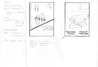
This print has too many colours and so i've gone back to the drawing board and decided to explore the idea i had about the table in April Oneill's apartment full of pizza boxes and of course the turtles weapons.
I wasn't happy about the direction of the designs above i just couldn't find the boldness of an image that sit right within the frame and including all the detail, so decided to explore a new idea i'd had.
To begin with i planned on showing Teenage Mutant Ninja Turtles II: The Secret of the Ooze but i don't think you can watch a sequel to a film without watching the original first. With that in mind i decided to approach and develop ideas that could relate to both as i don't think we'll have enough time to show it at all, with the end of the year approaching quicker every day.
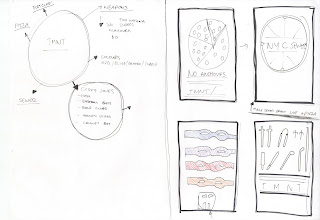
My first ideas focussed around the sewer drains and pizza and the masks and weaponry the turtles use during each film.

Keeping with the weaponry and colour theme i was drawn to the image of four turtle shells in different colours. But decided it was perhaps too similar to the Scrubs poster on blanka.
http://s-colley0710-dc.blogspot.com/2010/01/blanka.html
I decided to run with the sewer drain idea and came up with the idea of making the sewer cap look similar to a sliced pizza. I used the following image as reference:
http://www.nyc.com/image/users/blogs/4131.jpg
I started adding more detail to the sewer drain and opted to go for the sewer lid that looks more like a sliced pizza.
I think the illustration is bold and stands out and is a simplistic interpretation of the turtles franchise. I intended to have TMNT written across the sewer but there would be no pint having the title featured twice as central points of interest within a poster.
I tested to see when the type across the sewer worked best. I intended to have the the type but it looked better filled in as opposed to just the outline.
I decided to add some colour to the sewer cap by adding a vector but to follow with the rest of the imagery i tried out a full grey filled sewer cap, which i think works better.


--------------------------------------------------------------
Die Hard is a 1988 American action film and the first in the Die Hard film series. The film was directed by John McTiernan and written by Jeb Stuart and Steven E. de Souza.
I was happy with the initial layout but decided to add more details and played around with the line quality and weights.
Here i'd changed the opacity to create a more glass effect without using any filters and keeping in with the simplistic style.
--------------------------------------------------------------
The Goonies is a 1985 American adventure-comedy film directed by Richard Donner.
Ruth BABY Ruth
I want my posters to be a nod to my favourite movies. This is a deleted scene from the film, but it explains why the kids lie to a news reporter about a giant octopus. I'm not sure if many people besides die hard fans would get it but it's worth a mention anyway.

The inital ideas i went with were based around artifacts used by The Goonies in finding One Eyed Willies treasures. I also liked the idea of using a Baby Ruth wrapper but i felt the type wouldn't work as well if it wasn't clear enough.
I was also drawn to Data's gadgets. He is one of my favourite member of The Goonies alongside Chunk.
I was drawn to using Data's 'Pinches of Peril' and mocked out some layouts to try and achieve a layout which reflects the usages of the pinches of peril. In the film Data using them to stop himself falling to his death by latching them onto the ceiling
I played around with the size of the spring to get it in proportion with the teeth i'd created.
I decided to play around with the layout of the type but i think having the imagery under the type ruins the crisp and bright red of the fake teeth.
Scene with cutouts running through house on train track

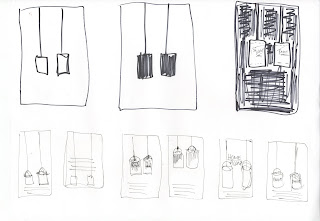
For me one of the most iconic scenes from the first two Home Alone films is when Kevin uses the paint cans to knock Harry and Marv down the stairs. Genuis. I started with doing some quick layouts and adding different amounts of details to each can.
I started from the beginning and produced some really simple paint cans that looked more like buckets and proceed to rework them and start to add more detail.
I'd produced some posters on the last module that featured paint drips so i re-used them within this brief.
I still wasn't happy so i started again using simple shapes to create a more 3dimensional feel for the paint cans. I wanted to create the paint cans so they resembled the cans used in the films but that would have required too many colours compared to the other prints. So i simplified them down to 2 colours + white.
And kept adding more detail.
Fill
Outlines
Drips
Type
I think the posters work well with the most detail and it becomes more obvious what i am trying to communicate.
--------------------------------------------------------------
I always planned on screen printing my posters but after i'd stripped, coated and exposed my screens unfortunately they remained blocked (left - around the f in film) which meant i've had to strip, coat and expose them again but again my prints we're not coming out correct.
So i decided to digitally print them and experiment more with folds and paper stocks.
----------------------------------------------------------------------


I produced two very rough mock ups and was extremely torn between the two. On the one the fold out works as a double sided poster, which although will make the information on the back be the same orientation (portrait). However, it means the viewer has to decide which way to pin it up.
----------------------------------------------------------------------


----------------------------------------------------------------------
On the other hand, i produced the mock up directly below, which folds down to a leaflet.

I've decided to go with the fold down leaflet and have started producing some layouts and deciding what information should be contained within the leaflet. I decided to include a synopsis, small bios of key cast and crew, and switch between trivia / other information.
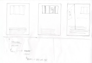
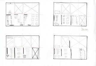
I produced a few layouts quickly. It was more to get a general layout sorted and i didn't want to dwell on the layout too much. I decided that the titles written down the side was a bit different and decided to go with that.
I started by decided upon typefaces. I originally went with Gotham, but it was suggested by a few that using the typeface from the post could defer away from its impact. And that a little variety within the design would make it more appealing so i moved away from that quickly.
DIN and Times
I was toying with the notion of including on the back page of the leaflet a list of future dates etc, but i wanted to create a panel of illustrations to go across the back folds.
DIN and Officina
I'd decided on my typefaces and a general layout of each section. I gathered the information required from two different sources: wikipedia and imbd.
http://www.imdb.com/Sections/Trivia/
I went through each leaflet and laid out the trivia section as below
but decided that having a black type would be boring and dull. By adding small amounts of colour to the type, it makes it stand out more and adds a bit of variation to the design.


I was having fun using two colours across the type'd part of the poster, but wanted to see how using numerous colours would work. I thought the use of four different colours representing each turtle would work really well but looked too much was going on and didn't sit well together.
On The Goonies poster i was going to follow the same layout as the other posters and have a trivia section, but i was reacquainted with the Goony oath and decided to try and include that in my design.

I didn't think having the oath crammed into one column was working and so decided to re-arrange the layout of the leaflet and panned the oath across two columns playing around with the type design and general placement of text.

I dropped the red type and played around with the formation of the characters and different line break symbols.


Originally i wanted to produce a series of illustrations to go across the front panels of the booklet. I produced a list of possible illustrations i could use but ultimately decided against this as i felt more illustrations would although on the opposite side, distract from the impact of the poster.


I decided to use the striped line image above across all the poster/leaflets. Speaking to Jane she said it reminded her of Spangles (boiled sweets) from back in the day, which is a nice fitting as eating sweets and popcorn is the norm for the cinema. Apologies for the overly pixalated image.
----------------------------------------------------------------------
Final Poster/Leaflet designs


----------------------------------------------------------------------
Product shots - i took over 70 photos of the posters and have uploaded the better ones. I'll probably use these photos for my website as well. I don't want my product shots to give everything away about them as they are best viewed in reality.
----------------------------------------------------------------------
Packaging
I want some sort of packaging to be able to collect the series of prints. I stumbled across world of envelopes.com and found a box mailer
I want some sort of packaging to be able to collect the series of prints. I stumbled across world of envelopes.com and found a box mailer
I was thinking with screen printing the box with a title and information on the back listing each film and it's show date.
Alternatively world of envelopes also sells Snazzy Bags which i think carry a cool aesthetic and a collection of posters contained within them with stickers? other tid bits might be a nice addition to the project.
254 x 180 mm
The packaging design below will be screen printed onto the box mailer, which should arrive tomorrow. I plan on screen printing them before we finish for easter and then the brief is finished, although me and jack have composed a new list of films for after easter so i will be producing a poster a week until the end of the module. Busy times.


----------------------------------------------------------------------
It was brought up in a crit recently that my work uses the same form across the board.
I think this is a good/bad thing. Although i work primarily with small publications and posters i can add extra context to my work by exploring different media. I want to produce some badges to go along with this brief, so am going to have them printed up asap. The badges will be part of the program pack that could be purchased at the event.
I think this is a good/bad thing. Although i work primarily with small publications and posters i can add extra context to my work by exploring different media. I want to produce some badges to go along with this brief, so am going to have them printed up asap. The badges will be part of the program pack that could be purchased at the event.














No comments:
Post a Comment