So Cath and Jack approached me and Andy to produce the Art and Interdisciplinary Year Book. At this point i've only uploaded the work i produced in response to this brief. From our meetings with Cath and Jack they were torn between two ideas one been a booklet year book and the other idea focused upon the exhibition viewers collecting postcards from each persons exhibit and collecting them within a case which we would design.
We decided after researching into the themes that the 26 and the cornucopia theme were best suited to the course as the others had negative connotations associated with slavery. We researched into the number 26 and found some interesting facts which provided us with some interesting directions. We decided to keep things simplistic as we don't want to defer from the work which will be shown.
The client was torn between themes and said that we could choose the name, we decided to make it easier for them to chose the theme of 26 and produce two variations around that theme - a booklet and postcard pack. I started to focus upon geometric shapes and how i could have these followed through the brief.
 Initially we were designing ideas for each product but due to time restrictions we split and decided we should produce a product separately and present it to the client. Over the course of 1.5 days we produced 2 mock ups. I wanted to produce a booklet so i took charge of that.


I started by experimenting with 26-sided polygons in illustrator and ended up producing the poster below
and the rest of the booklet stemmed from that poster.
26 - 26sided polygons
26 squares rotated to create a spirograph like image
A rhombicuboctahedron is a 26-sided shape.
I figured that the simple 26 sided polygon would be a good graphic element to carry throughout and was simple enough to not defer attention away from the work. My idea for the booklet is reliant on stock variation using newsprint, tracing paper + others, as the client said it should have a more handcrafted feel to it and hand stitched, which is a reasonable request but we highlighted that having a run of 200 handcrafted books may prove too expensive for their budget.
--------------------------------------------------------------------------
THERE IS MORE TO LIFE THAN A FORMAT
which is why i decided to produce the layouts on B5 which coincidently is the size of most books.
The layouts i produced were based upon the layouts we'd developed for the BAGD year book.

 The typeface i used initially EloquentJF and Times but i felt they didn't work well together and perhaps the Eloquent was abit too bold for an Art year book, so i started to look at Times and Officina which are both small typefaces which wouldn't defer from the attention of the images.

Me and Andy came up with the idea of two/six as it created more mystique around the booklet/postcards but later Andy thought it would be cool to use 'The 26' as the title for the student list page, so i decided to use that as the title for the publication.
 The double page spreads below would be used as tutor comments and spaced around the publication, below is an exploration of using the different type styles.
 Officina (quote) Times Italic (Author)
 Times Bold Italic (Quote) Officina (Author)
 As above but underlined
----------------------------------------------------------------------------------
Double paged spreads


 Idea hear was to have a photograph of the studio in black printed on tracing paper or thin stock and have the crossed polygons clear to see through the tracing paper to the pages before and after.


 The overall design of the mockup is very graphicky but the client liked it, unfortunately we have since found that there is 27 people on the course, which may prove difficult for Andy but its simple change for the booklet. We've sent the mockups to the client and are waiting for them to make a decision. If they do not choose to continue with the booklet i am going to continue it as a research booklet into the number 26 and over Easter i'm going to explore stock options as to how to get the handcrafted feel they wanted and look for printers that provide short run and hand stitch binding.
----------------------------------------------------------------------------------
Mock up photos.
B/W


----------------------------------------------------------------------------------
It has been a while since me and Mcgow have touched this project. There were a lot of changes to the group we were working with from the art and interdisciplinary course and a great deal of miscommunication all round really. I feel though as if we are heading on the right track after we'd received more information that we need, such as blurbs, portrait photos. We still however are waiting upon the images for some work.
We had a short tutorial with Justin and then another one with Joe which went really well and gave us a definite jolt into action. We discussed layouts and possible places to get the job done on time and use an effective amount of the budget.


----------------------------------------------------------------------------------
We produced a varied amount of layouts and variations trying to build on what had been said in the feedback from the first mock up. We have a meeting with the team and tutors on Monday.
----------------------------------------------------------------------------------
They seemed happy with the direction we had gone in with this version. One point of discussion was the body copy. They thought the original typeface we used (image below) was too condensed. We explained we had used a condensed font as to prepare for the longer length blurbs written by the students.


We tried out different weights of futura and ended up producing the rest in Futura Book
----------------------------------------------------------------------------------
Forwards
Each tutor provided an introduction to the booklet so we started looking at different layouts playing around with the composition of the quote and body copy.
We increased the size of the quote to give it more impact.


We found a composition we were happy with for the first introduction by the course leader. Another introduction 'Curiousty' was after so we again explored a few options laying out different compositions.


----------------------------------------------------------------------------------
We had another meeting with the course team and we decided that there was too much text across the double page spread.


----------------------------------------------------------------------------------


We received another introduction from the course team and added that to the mix. It didn't have a title but mentioned about a disclaimer so we thought having an asterisks as the title symbol.

----------------------------------------------------------------------------------
Contents
Again we produced different layouts of the introductory pages


----------------------------------------------------------------------------------


----------------------------------------------------------------------------------


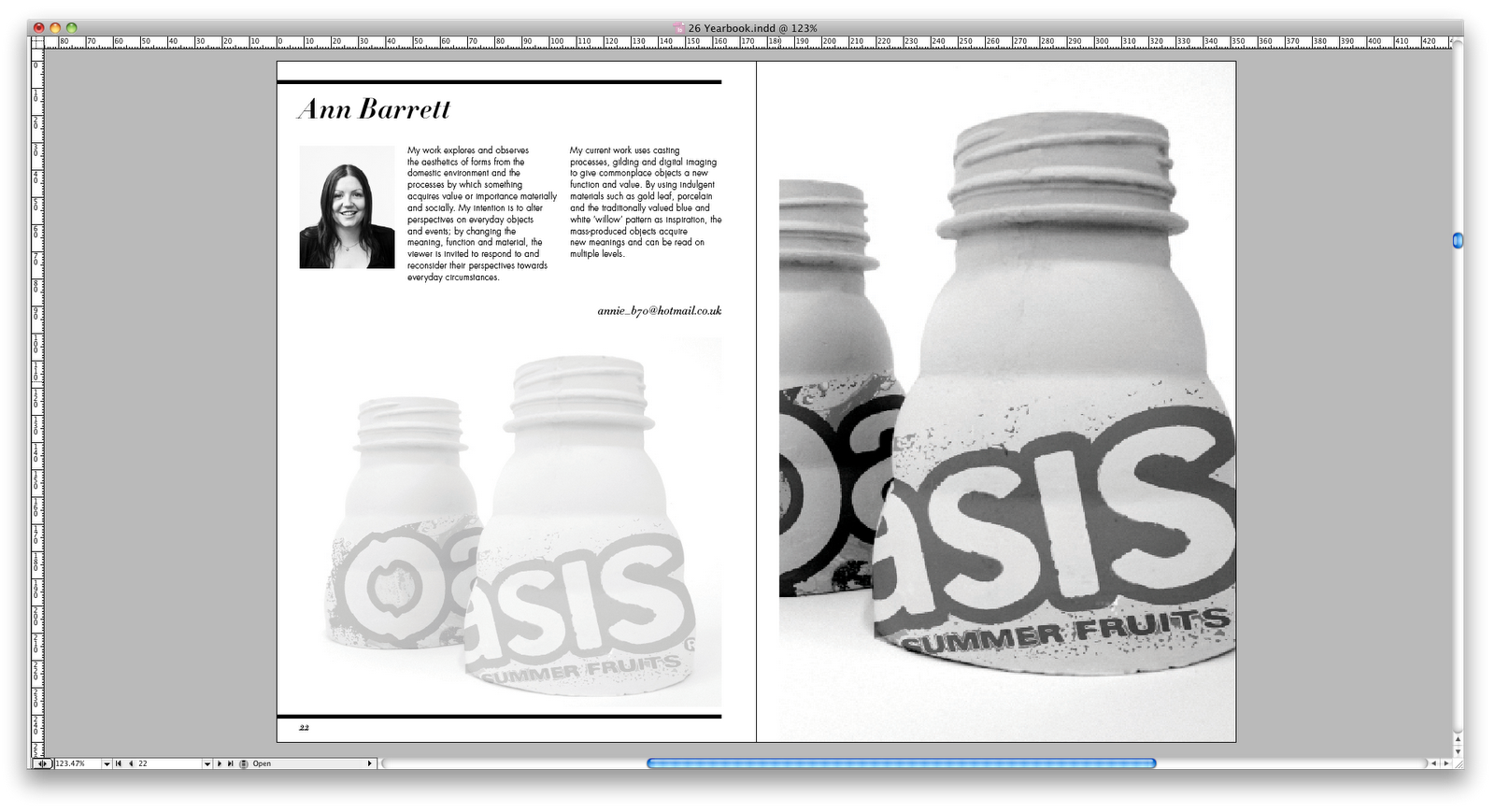
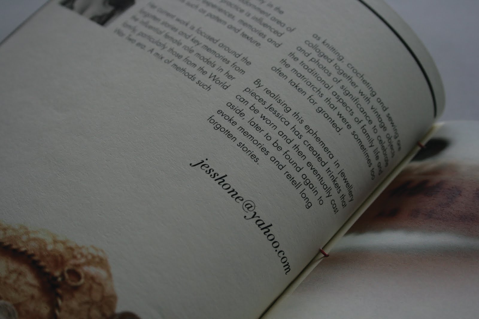
We produced various layouts for each student. And after the meeting with the course team the students had critiqued their pages and noted some changes that needed to be made. Only small tweaks.
It was also mentioned that the numbers in the email addresses looked too much like I rather than 1.
----------------------------------------------------------------------------------
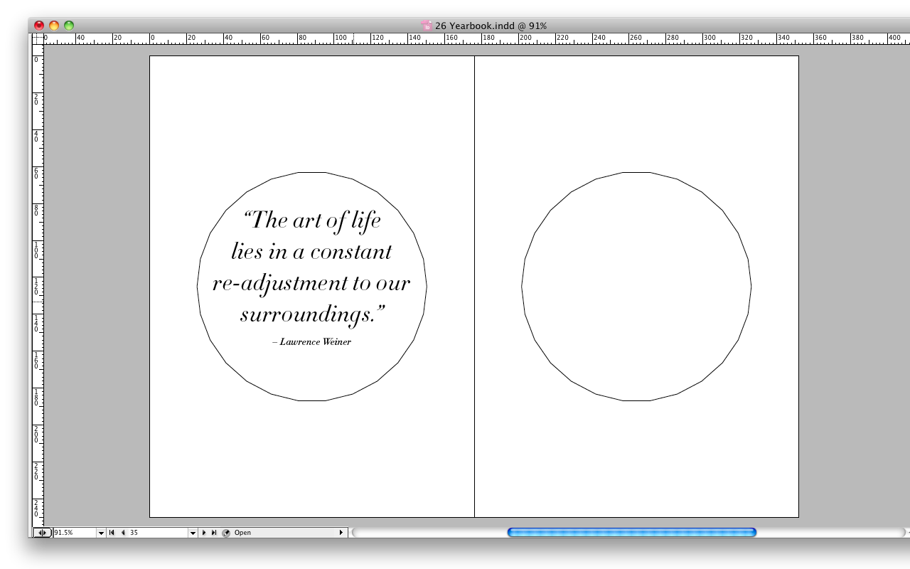
In between each group of students we planned on having a break page and set about using the icosikaihexagon. It was decided in the meeting that it would perhaps be better if these break pages had a quote of some kind.


----------------------------------------------------------------------------------
Mock Up 2
Full Colour
Japanese Stitch bind


----------------------------------------------------------------------------------
Promotional Poster for the event
----------------------------------------------------------------------------------
Printing
We sourced out a list of printers and spoke to them about costings of printing. Turns out the size of the booklet we'd decided on was actually a difficult size to print onto the sheets they have at printers. Andy had been liaising with Team Impression who worked hard to get the book at the budget required.
We also had quotes from Jade and Duffield.
Jade

Duffield

Team


In the end we decided to go with Team as it was a great opportunity to work with a fine set of printers. The quote was only valid until 1st June as the paper merchants are increasing prices by 10%. We were then informed the quote Team had given us was for an A5 booklet. It was no-ones fault really there had simply been a miscommunication of what we were looking for. We asked for them to try and get in on budget for us and the result was an A5 booklet.
We spoke to Cheryl, Course Leader of Art and Design Interdisciplinary and she put it to the students who were in on that day. They said it was cool to go A5 so we dropped it off at Team on Friday. Glenn at Team walked us through the process and was kind enough to give us some gifts
----------------------------------------------------------------------------------
We just got word from Cheryl that the proofs had arrived and that there was some tweaks to be made. I can't think for the life in me what could be wrong. It could be to do with having to shrink down the document to A5 had drastic affect on the types point size. If it is spelling, everyone who proofed the document failed to notice something wrong. We have a meeting tomorrow (after the deadline, unfortunately) to find out whats wrong and hopefully it will just be some minor tweaks which we can address straight away.


